
Powerful Decision Making with BI

Being in business is being in the business of decision making. Right decisions, made at the right time, and implemented in the right manner—make all the difference
Automate project status reports – so you never miss to share important details.

Get automated status reports on time and provide comprehensive and correct information.
Enterprise-level innovation is democratized and available for SMB

Trends relating to cloud, mobility and data driven collaboration mean that SMBs can be every bit as sophisticated and cutting edge as large enterprises.
Changes in Power BI licensing

Microsoft has unveiled a new licensing option for Power BI with changes in user licensing flexibility. Learn about those changes and their implications…
Is your organization truly data-driven?

You are a bank manager. You discover the customer churn rate of your bank which has steadily increased. You realise a loophole in retaining the existing customers of your bank. To validate your instincts, you gather the past six month’s data of customers and hire an analyst to come up with the results quickly. But here is the problem. Analyst working on the project realises that the data has a lot of noise, is not captured at a granular level, is coming from multiple sources, not a single version of the truth and is also limited. Hence insights can’t be drawn at the required time. This results in loss of business. Does this scenario sound familiar to you? The reason behind this grief is the bank is not a data-driven organization. Is your organization data driven? Do you embrace data? Can you provide decision makers of your company with the data they need? Does your organization make business decisions with the help of high quality, noise free, granular data? Are all the data sources integrated at one place providing a single version of the truth? If your answer is yes, then congratulations!! You are indeed a data-driven organization. But if the answer is no, you should infuse analytics in your company. In today’s digital age, we are engulfed with an enormous amount of data. It is an acceptable fact that organizations who have the knowledge to extract insights and decisions based on data would be at a competitive edge rather than the organizations who still have not understood its value. We’re in a digital transformation age where data is more valuable than ever. Companies would only be able to have a competitive edge if they truly understand the power of data and promote the use of data in decision-making. Switching to a data-driven organization usually takes time, but hard work pays off. Constructing this sudden shift is a tedious process but this journey from capturing data to making it trustworthy ensures everybody in the company is on the same page with the most updated information at their fingertips. So how do you turn to a data-driven organization? Below are few points to get started: Information Management: Start capturing the data from the most granular level. Each single field should be detail-oriented. This ensures that every single detail of all the business processes in an organization is identified and stored in databases. Data Integration: Often data does not reside on a single data source. We rely on data warehouses to integrate our disparate data sources. Traditional data warehousing can take up to 6 months to 1 year and significant effort to complete. Surely this is not the right way to stay competitive in today’s ever-changing and ever-evolving data landscape. Is there any solution to optimize the data warehouse lifecycle? This is where automation comes to rescue. We now have self-service data warehouse tools with drag and drop capabilities just like modern BI tools. TimeXtender is a leading data warehouse automation tool which automates the entire cycle of implementing and maintaining a DWH/BI solution. Other notable vendors in this space are Wherescape and Attunity. Next Gen BI Tools: Are you still using traditional BI tools for data integration and reporting? If yes, then you have already lost half the battle. Businesses today can’t wait for weeks or months for the BI reports. And this is where self-service BI tools like Tableau, Power BI, Qlik provide an edge over the traditional IT-centric reporting tools. You can have dashboards/reports in just a few clicks without any involvement of IT. Teamwork and Collaboration: This should be one of the key focus areas to become a data-driven organization truly. Self-service BI tools provide a platform that allows analyst, data scientists, decision makers to work collaboratively and act sensibly on approaches for deriving insights of a company. With the help of collaboration, all the members working on a data intensive project are now able to collaboratively work with real-time access to all the features of a BI tool. Training & Reskilling: Employees should have basic knowledge of reporting skills. Also, the power users of analytics must be reskilled and trained with the latest development in analytics space. This ensures that your organization is well equipped to support value-driven decision making. Welcoming a data-driven approach is vital to your organization. It helps you in making decisions that are informed, intelligent and impactful. To understand more about making powerful decisions that lead to desired results, Register for webinar recording on Make powerful decisions with Power BI
Enable Your Data with Adaptive BI for Excellence
Right use of enormous data available internally and externally to organizations can generate immense dividends. Deriving meaningful insights from that data—and converting knowledge into action—is easier said than done.
Organizations have been utilizing Business Intelligence (BI) and analytics to analyze and visualize complex data sets, but the biggest challenge is finding the set of right solutions that enable organizations to generate value through the process efficiently. As the data management challenges grow, the use of BI within the organization has extended and triggered the need for self-service BI – to enable everyone to gain visibility into business operations and to make data-driven decisions efficiently, today and for the years to come.
So, what’s next? Companies need a right mix of people, processes, and technology to enable and govern their data and unleash the real value of it.
Advaiya’s Adaptive BI services fulfil an organization’s need for data aggregation & visualization across its functions. With our extensive knowledge and expertise, association with state-of-the-art technologies like Microsoft and TimeXtender, we deliver a BI solution that meets business analytics needs at all stages of the BI lifecycle. We deliver intelligent insights with user-centric information design to help you become more mature and capable data-driven organization.
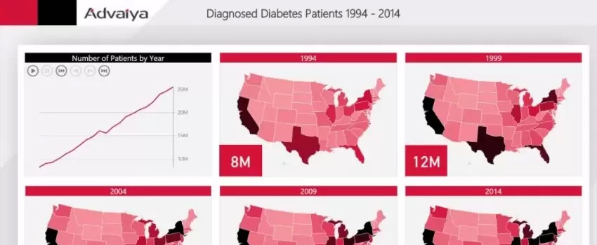
We use an intelligent and structured approach to bring your data to next-level and help get all the valuable data and comprehensive insights at your fingertips. We make advanced technologies, like Power BI and automation to enable data discovery, availability and comprehension, so you can use your data effectively, today and in future. Just an example, how an appropriate information design with comprehensive data from multiple sources provided significantly useful insights for disease control and prevention via rich visualization.
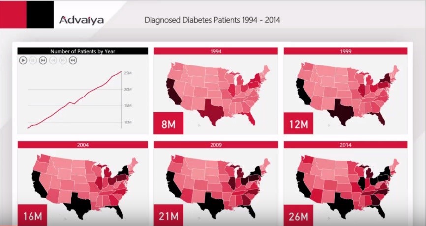
Get easy access to data from multiple sources, gain insights via interactive dashboards & reports, be informed and make better decisions.
Get started today with D.I.A.D (Dashboard-in-a-day), our Data Enablement services to help you understand your data better through meaningful visualization.
How to Use Power BI Mobile Apps to View and Interact with Reports and Dashboards

Power BI makes your data travel along with you and stays connected to your data from anywhere, anytime with the Power BI app for Windows, iOS, and Android.
Power BI Apps for Mobile Devices
Power BI mobile app lets you connect to your data anywhere and anytime once you’ve created Power BI reports in Power BI Desktop, and Power BI dashboards in the Power BI service and published to http://powerbi.com/.The Power BI mobile apps apply to following devices:

Sign Up For The Power BI Service On The Web
• First, you have to sign up for Power BI service, go to http://powerbi.com/ for creating and storing dashboards and reports, and to bring your data together.
• Then to see your dashboards sign in to Power BI from your Android phone.
• In the Power BI service, tap Sign up to create a Power BI account.
• Start creating your dashboards and reports.
Viewing a Dashboard
Tap the dashboard to open it.
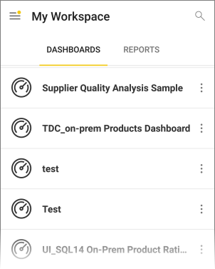
• Yellow stars show the dashboards which are put in favorites.
Power BI dashboards look a little different on your phone. All the tiles are of the same width, and they’re arranged one after another from top to bottom.
To view them in landscape mode you can turn your phone sideways.
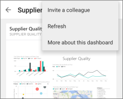
1. On the dashboard, tap the vertical ellipsis (…) next to the name to invite a colleague, refresh, and to get more information about the dashboard:
2. Swipe up and down to see all the tiles in the dashboard.
Viewing Your Favorite Dashboards, KPIs, and Reports
On the favorite page, you can see all your favorite Power BI dashboards, together with Reporting Services KPIs and mobile reports.
• Tap Favorites

• All your Power BI favorites and your favorites from the reporting services web portal can be seen on this page.

Viewing a Report
When you create reports in Power BI Desktop, you can create an optimized version for phones too.
• Open a Power BI report:
• Tap reports on the main page of the Power BI mobile app, then tap the report you want to open.

• All the Power BI reports, and Excel workbooks that you have in the Power BI service can be seen here.
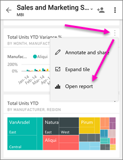
• On a dashboard, tap the ellipsis (…) on a tile then Open Report.
• To view other pages in a power BI report:
? Swipe from one side or the other, or tap the page name from the Pages icon in the lower-right corner.
To Sort a Chart
• Tap your chart, tap the ellipsis (…) and tap the field name.

Sort order can be reversed too by tapping the Sort by arrow, then tapping the same field name again.
To Filter a Power BI Report
• First, expand the filters pane.
• If you have set page-level filters in your report, then after selecting a visual you will see visual-level filters for that visual and for the whole page, page level filters will be seen.
• Select check boxes for any values you want.
• You can also switch the filtering mode by tapping Basic filtering or Advanced filtering to select values using expressions instead.
• Expressions such as are less than, is greater than, is not, and is blank is offered by number fields.
• Expressions such as contains don’t start with, and is not is offered by Text fields.

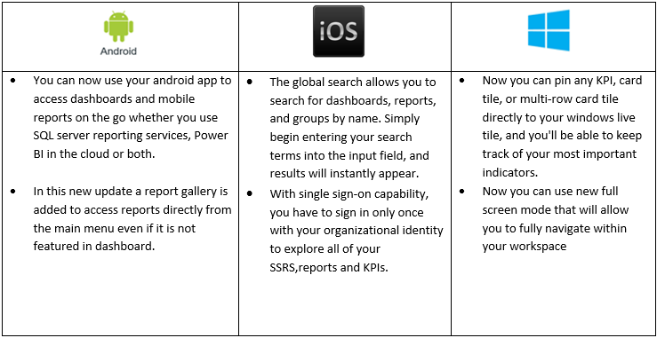
New Added Features in Power BI Mobile Apps
Meet your specific information needs and take better decisions with solutions for visualization and aggregation of data from across your business with our Adaptive BI solutions. Whether on your mobile, or on your intranet, our solutions enable performance monitoring, and intelligent insights. We make advanced technologies, like Power BI and automation for connecting and consolidating data from multiple sources, work for your business and purpose.
Visit www.advaiya.com/services/adaptive-bi to discover more.
Reinforce Self-service BI with Data Discovery Platform

Ever changing market needs, rapidly shifting business contexts and increased competition demand businesses to make important decisions quickly. To gain a competitive edge and ensure long-term success, business decision makers want to access data at all times, wherever they are. Further, organizations generate a huge volume of data at a high velocity. And hence, IT teams are under great stress as they are facing several challenges, like combining data from disparate sources, ensuring data security & governance, and providing high quality data to deliver valuable insights. At the same time, business users no more want to rely on IT for getting access to the useful information to do their jobs. Data discovery has a central role in enabling business and IT to address these challenges and needs. While generally, more data lead to more opportunities for more relevant insights, the right data has to be discoverable and easy to surface. What this means is that organizations need to have tools allowing accumulation and structuring of data from multiple systems, and information sources.. Data discovery, thus, is one of the more relevant technology areas. The traditional technical means could be very tedious, time-consuming and labor intensive. On the other side, business users are demanding greater speed, ease of use, and instant visibility. Modern data discovery technology is about gathering data from different sources, including legacy systems and processes in such a way that it allows meaningful insights to users flexibly and quickly. Data discovery solutions also have to address challenges of consistency (as business users keep multiple copies of same data), handling multiple source systems and changes happening there, and governance (including, access controls, auditability, and version control). Since data discovery profits both IT and the business, it’s important for each group to take steps towards evaluation and adoption of a data discovery platform. Many BI solution providers are continually building new capabilities to make the data discovery more powerful, governed and easily manageable. Today, many tools are available that support governed data discovery and each of these tools offers a unique approach to data discovery and, thus self-service Bl. According to Gartner Magic Quadrant for Business Intelligence and Analytics Platforms 2016, the main focus in the coming years for BI industry would be on self-service analytics and governed data discovery. TimeXtender is a leading solution for data discovery. Its Discovery Hub approach allows highly automated creation of modern data warehouses built on a powerful operational data exchange. This, in conjunction with data visualization and reporting tools like Qlik, Power BI, Tableau etc., allow business users to gain insights via self-service BI feeding on data discovery across all relevant information sources. As a premier TimeXtender Partner, and having Microsoft Gold competence, Advaiya’s BI and Analytics practice is focused on building and providing BI solutions with visualization and data discovery platforms.
Interacting with Power BI dashboards and reports in PowerPoint

Power BI team recently added the functionality to export Power BI reports to PowerPoint (in Preview). The feature does not go very far though, in that, you cannot interact with the reports or dashboards in the ppt. However, there has been a way to bring in your dashboards and reports into PowerPoint and Excel while maintaining their interactivity using a lesser known app. In this blog, I will share the steps to use that add-in and some of its advantages and limitations.
 The biggest advantage is, of course, the interactivity, while maintaining the flow of the presentation and not switching out of the presentation to go to the dashboard and back.
You can set a specific tile as the default tile on a slide when you are connected to a dashboard. All you need to do is save and exit with a tile showing on a slide, then you will see the same tile on that slide when you open the presentation again. If you wanted to, you could embed the dashboard multiple times on multiple slides showing different tiles, then annotate each one separately to talk about the key points on each.
The add-in can connect to both reports and dashboards, so you can navigate through the tiles of the dashboard as well as the pages of the report.
 Only the tiles on the dashboards are visible. When you are trying to view a dashboard that has a live page pinned to it, the live pages do not show up on PowerPoint.
When you are connected to the report, the report page and filter settings in the PowerPoint will always be the default report page and settings you would have seen when you logged in to Power BI. I tried saving the .ppt with two different report pages on two different slides, but it defaulted to the same page when I opened the PowerPoint file again.
There is an option to show a visual (a tile or a report page) as a saved image, which is great if you want to prepare your presentation around specific data or images that you do not want to change or refresh before your talk, but then you lose the ability to refresh the visual.
And finally, here’s how you make your presentations more attractive!
1. Open your PowerPoint presentation. Click on “Insert” in the top bar.

2. Click on “Store”.

3. Under Office Add-ins, click on “STORE”. Once you get this add-in, you will find it under ‘MY ADD-INS’.

4. Type “Power BI” in the search box and search.

5. Add the “Power BI Tiles” add-in.

6. Click on the “From Power BI” button.

7. Enter your credentials to access your Power BI site.

8. Navigate to the workspace – personal or group, where the desired dashboards and reports are present.

9. If you want to connect to a dashboard, click on the dashboard name. If you want to connect to a report, click on “Reports” next to “Dashboards”.

10. Your dashboard tile appears on the slide!, as you see!

11. You can resize it and/or click on the arrows in the middle to navigate through the tiles.

12. You can also bring in a report and scroll through the pages while interacting with the slicers and filters.

13. To show a visual as a static image, click on the tile or report, then expand the arrow near the top on the right side of the visual.

14. Select “Show as Saved Image” in the list of options. The visual will be converted to an image.
